By default components don’t come with any CSS styles because the general idea is that every component should come with it’s own style. Let’s add styles to opportunityCard.cmp, then opportunitySelect.cmp and finally to opportunities.app.
opportunityCard.cmp
Add Styles
- Open
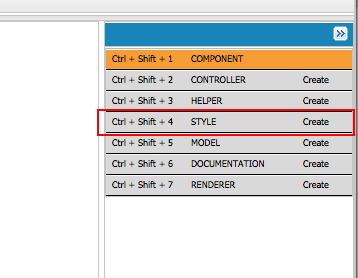
opportunityCard.cmpand click on theStylesbutton in the side panel of the Developer Console.
- Copy the below CSS classes. To ensure css classes don’t clash, that every css class is namespaced with
.THIS. At run-time.THISwill be replaced by a unique class name.
.THIS.recordLayout { list-style: none; padding: 14px; border-bottom:1px solid #cfd4d9}.THIS.listRecord { background-color: #ffffff; margin: 14px; border-radius: 5px; border: 1px solid #cfd4d9; position: relative;}.THIS .uiInputSelect { margin: 0px 4px;}.THIS .uiOutputText { line-height: 1.1em;}.THIS.listRecord button { display: inline-block; outline: 0px none; border: 0px none; background: transparent; position: absolute; min-width: 16px; min-height: 16px; max-width: 32px; max-height: 32px; right: 0px; top: 0px;}.THIS.listRecord button.trash {}.THIS.listRecord button.lock { right: 32px;}.THIS.listRecord button.unlocked { }.THIS.listRecord button.locked { }.THIS .pin .label { width: auto;}.THIS .itemTitle { font-size: 15px; padding-bottom: 3px; overflow: hidden; text-overflow: ellipsis; white-space: nowrap; }.THIS .recordCell { padding: 1px 14px 1px 0; line-height: 16px; max-height: 16px; display: inline-block;}.THIS .recordItem { overflow: hidden; text-overflow: ellipsis; white-space: nowrap; }.THIS .recordItem .label { padding-right: 14px; width: 125px; color: #696e71;}.THIS .value { }.THIS .truncate { overflow: hidden; text-overflow: ellipsis; white-space: nowrap; }.THIS classnameNote: If your markup’s top level element uses any CSS class it’s namespace should not have a space between the THIS and the css-classname like
.THIS.recordLayout. But if any inner element use a class they should have space like.THIS .myInnerElementCssClass
Update Markup
Update the markup of opportunityCard.cmp component to include some CSS classes (Remember to change the namespace).
<aura:component controller="NAMESPACE.OpportunityController"> <aura:handler event="NAMESPACE:selectOpportunity" action="{!c.handleSelectOpportunity}" /> <div class="listRecord recordLayout"> <div class="itemTitle"> <ui:outputText class="itemTitle" value="{!m.Name}"/> </div> <div class="recordItem"> <ui:outputText value="Account Name:" class="recordCell label truncate"/> <ui:outputText value="{!m.AccountName}" class="recordCell value truncate"/> </div> <div class="recordItem"> <ui:outputText value="Amount:" class="recordCell label truncate"/> <ui:outputText value="{!'$' + m.Amount}" class="recordCell value truncate"/> </div> <div class="recordItem"> <ui:outputText value="Close Date:" class="recordCell label truncate"/> <ui:outputDate value="{!m.CloseDate}" class="recordCell value truncate"/> </div> <div class="recordItem"> <ui:outputText value="Stage:" class="recordCell label truncate"/> <ui:outputText value="{!m.StageName}" class="recordCell value truncate"/> </div> <div class="recordItem"> <ui:outputText value="Opportunity Owner:" class="recordCell label truncate"/> <ui:outputText value="{!m.OwnerName}" class="recordCell value truncate"/> </div> </div></aura:component>opportunitySelect.cmp
Let’s add styles to opportunitySelect component.
Add Styles
- Open
opportunitySelect.cmpand click on theStylesbutton in the side panel of the Developer Console.
- Copy the below CSS classes.
.THIS.controlLayout { padding: 14px; background-color: #ffffff; margin: 14px; border-radius: 5px; border: 1px solid #cfd4d9; white-space: nowrap;}Update Markup
Update App’s markup to use these new styles.
<aura:application> <div class="container"> <div aura:id="content" class="center content"> <div> <aotp1:opportunitySelect/> <div aura:id="cards"> <aotp1:opportunityCard/> </div> </div> </div> </div></aura:application>opportunities.app
Let’s also add our app’s CSS.
Add Styles
Select the opportunities.app and click on Styles button and add the following css.
.THIS.container { width: 100%; padding: 10px 0px; margin: 0px;}.THIS .center { margin: 0px auto;}.THIS .content { max-width: 768px; font-size: 12px; color: #3c3d3e;}Update Markup
Update the markup of opportunitSelect.cmp component to include some CSS classes (Remember to change the namespace).
<aura:component model="NAMESPACE.OpportunityListModel"> <aura:handler name="init" value="{!this}" action="{!c.doInit}" /> <div class="controlLayout"> <ui:outputText value="Opportunity:" class="truncate"/> <select aura:id="opportunitySelect" onchange="{!c.onSelectOpportunity}"/> </div></aura:component>Test The App
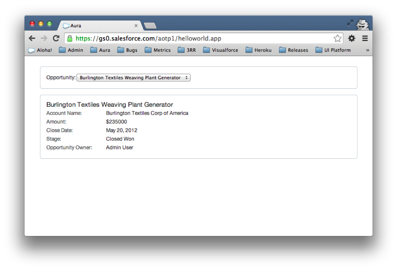
Click on the Preview button in the side bar of the Developer console or go to: <your org>/<namespace>/opportunities.app in a browser.